Client Brief
Western Heights Learning Center is a five star accredited childcare center serving families in the South Valley of Albuquerque since 1968.
The client reached out to me in order to clean up a their brand as it has become messy due to a lack of brand standards. They also wanted to modernize the look of WHLC in order to appeal to a modern clientele.
Since this was a refresh and not a full on-rebrand I was asked to maintain the existing logo type as well as reimagine the WHLC owl that was first created in the ‘00s.
Creative Objectives
When crafting the new logo mark for WHLC I knew I wanted to employ on clean, balanced line work for the owl. This ensures that my refreshed logo has a much longer shelf life that the previous ‘00s cartoon style logo. The new logo will age gracefully.
Being that WHLC was founded in 1968, there is a rich legacy of excellence and continuity of service in the South Valley. This concept of steadfast service inspired me to craft a logo using one continues line, if possible.
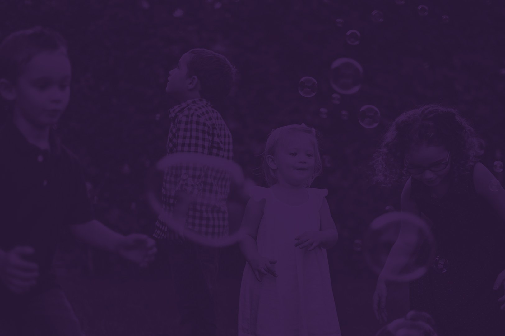
The client had a preference toward purple—so purple it is.
Mood Board


The Design


Get creative.
Let's connect and craft something stunning together.
Message me with information regarding your creative needs and I’ll be in touch to talk about the scope of the project.